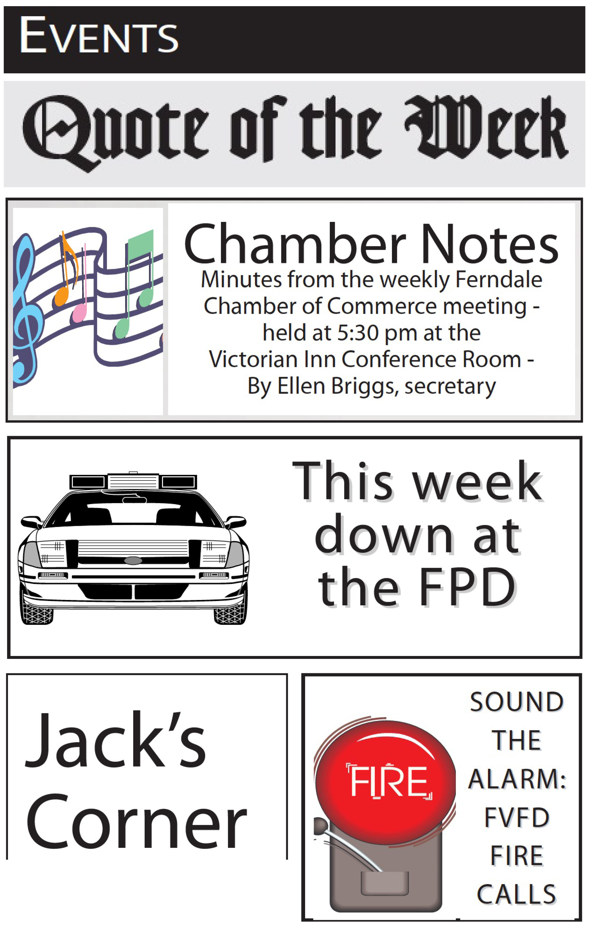
All of these standing heads are from the same newspaper. Every one is different. A study in inconsistency.
When was the last time you gathered your staff and took a close look at your newspaper’s design?
Is it working for your readers?
Is it easy to produce on deadline?
Is it contemporary?
Is it compelling?
Is it true to your design style?
I suggest a design critique every quarter…at least every six months. Go longer than that and you risk an erosion of your design style. Inconsistencies (see illustration) begin to creep in and, before long, your “design” is no longer a design. It’s just something that happens every issue.
When you do your critique, here are key items worth reviewing:
VISUALS
Is there a dominant visual on Page 1 and other open pages?
Are your photos/graphics large enough on the page?
Are lead visuals placed over the optical center on open pages?
Are they good quality?
Are they properly (read that “tightly”) cropped?
How’s your print/reproduction quality?
TYPOGRAPHY
Are you using a strong, legible type face for text?
Are word spacing and letter spacing too tight? Too loose?
Are your columns too narrow for easy reading? Too wide?
Is text aligned to the baseline grid?
Are you watching for—and fixing—widows?
Are you careful to avoid excessive word spacing and letter spacing in text wraps?
Are your captions set large enough?
Are your captions set too wide?
Are your headline type faces consistent?
Do you avoid the use of funky fonts?
Do you practice good headline hierarchy?
Do you have a consistent text style for lists, such as police and fire runs, calendars and the like?
Do you have a consistent text style for infoboxes, by-the-numbers boxes and the like?
Do you have a consistent style for pullouts?
Do you have a consistent style for drop caps?
Are your typographic styles set up in your software style sheets?
OTHER
Is placement of content consistent from issue to issue?
Is placement of ads consistent from page to page?
Does the design/typography of your nameplate need tweaking?
Do your teasers do the job, or do they need updating?
Are your design elements simple? Consistent?
Do you use color carefully and with a purpose?
That’s my list. I’m assuming you have other items you’d want on your list, but those I’ve mentioned here will give you a good start.
NEXT MONTH Now that you know what you’re looking at, who does the looking, how does it work…and who’s in charge?
WANT A FREE evaluation of your newspaper’s design? Just contact Ed: edh@henningerconsulting.com | 803-327-3322
IF THIS COLUMN has been helpful, you may be interested in Ed’s books: Henninger on Design and 101 Henninger Helpful Hints. With the help of Ed’s books, you’ll immediately have a better idea how to design for your readers. Find out more about Henninger on Design and 101 Henninger Helpful Hints by visiting Ed’s web site: www.henningerconsulting.com
ED HENNINGER is an independent newspaper consultant and the Director of Henninger Consulting. On the web: www.henningerconsulting.com. Phone: 803-327-3322.