Let’s face it: If you have a ‘new kid’ doing design on your staff, you’ll have some design mistakes in your paper from time to time.
It takes a while, perhaps months, for the design rookie to learn what works and what doesn’t. And during that time, he’ll do some things that may make you cringe. It’s OK, as long as you work with him to make sure he doesn’t repeat them.
Here are “top ten” mistakes you can watch for, and correct:
1. A DROP CAP in an indented paragraph. This a mistake common to many new designers, but one that’s obvious. Your readers may not know how it happens, but most of them know it’s just not right.
2. CENTERING indented type. Like the indented drop cap, it’s an easy enough mistake to make, and correct.
3. JUSTIFYING TEXT vertically to have the type fill a deeper space than needed. Those who have been doing design for some time may continue to make this mistake, because it’s a quick and easy way to fill a hole. But it’s lazy and it contributes to design sloppiness.
4. USING THE SPACE BAR instead of the tab key to align columns in tabular material. It may be a quick solution, but it’s uninformed and it contributes to a ‘whatever works’ approach to design.
5. USING A TINT BLOCK behind a story. This is a design approach whose time has gone. Rookies may try to resurrect it, but it’s just something we don’t do anymore.
6. POOR USE OF COLOR. The rookie may choose to use color type in a headline. That’s OK (sometimes even preferable) on features pages, but not in news. The rookie may be tempted to run a sports headline about a big win in your high school team’s school colors. Let’s help him get past that.
7. ALLOWING HYPHENATION in a headline. Think this just can’t happen at your paper? Well, it does happen, so just watch out for it.
8. ALLOWING HYPHENATION in a pullout. Just like a headline, a pullout is a display element. And if hyphenated type is the default in your design software, then it’s easy enough for the new kid to make this mistake.
9. NARROWING TYPE next to an ad. When he has to deal with a story that runs above ads, the rookie may think that part of the solution is to narrow the text next to the ad (see illustration). Nope. This makes the text difficult to read and it can create word-spacing and letter-spacing problems.
10. USING FUNKY FONTS. When dealing with a story about a snowstorm, the rookie may be tempted to run the headline in a typeface where the letters are snow-covered. Or he may look for a headline face with animals in it for a feature on pet adoption. Let’s make it clear to him that we just don’t do that.
Rookies will make mistakes. A young basketball player may sink a shot in his own goal. A new driver may signal left, and then turn right. It’s OK. Mistakes happen. We need to help our rookie designers learn from those mistakes, and not repeat them.
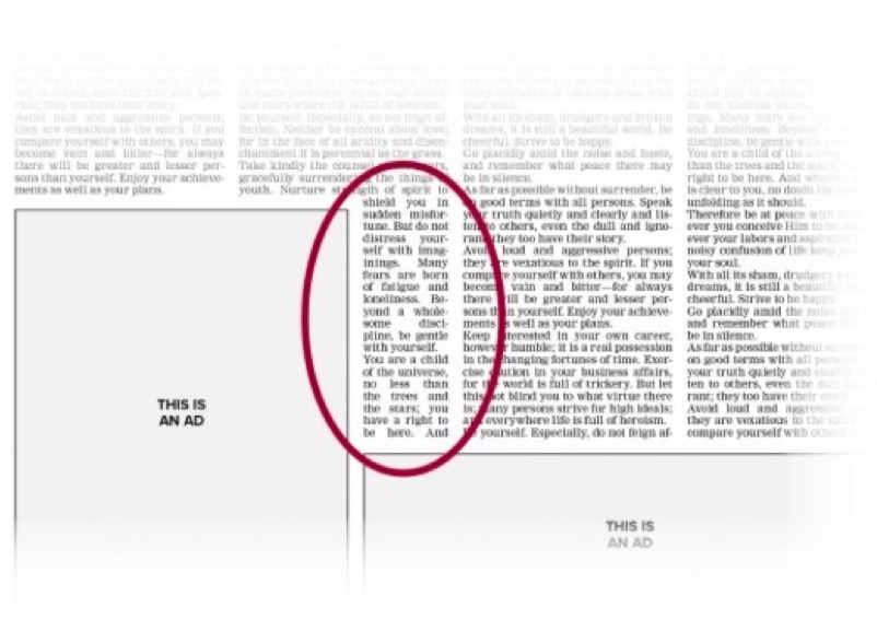
(Narrowing text type to wrap it around an ad – yep, that’s a rookie design mistake.)
WANT A FREE evaluation of your newspaper’s design? Just contact Ed: edh@henningerconsulting.com | 803-327-3322
IF THIS COLUMN has been helpful, you may be interested in Ed’s books: Henninger on Design and 101 Henninger Helpful Hints. With the help of Ed’s books, you’ll immediately have a better idea how to design for your readers. Find out more about Henninger on Design and 101 Henninger Helpful Hints by visiting Ed’s web site: www.henningerconsulting.com
ED HENNINGER is an independent newspaper consultant and the Director of Henninger Consulting. On the web: www.henningerconsulting.com.
Phone: 803-327-3322.